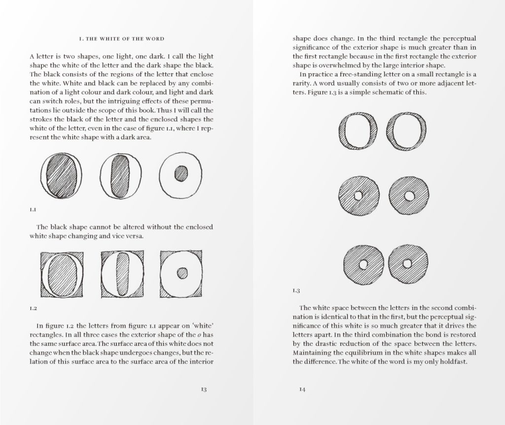
Using a geometric font to present Gerrit Noordzij’s The Stroke is something I have always wanted to try. I wanted to do it when I first saw Gerrit and his cube model.
What he was doing was looking at the positive and negative spaces of a typeface graphically, and I thought, ah, there’s nothing like Futura for this book: it’s so graphic that the negative space of each letter is close to a geometric figure. So I used Futura to reformat the passage about positive and negative space in the book and replaced the illustration with enlarged Futura characters.